JUJO
A colorful beverage website built on bold packaging, energetic art direction and playful, responsive design.
- E-commerce website
- Responsive design
- Visual direction
What the businesswas up against.
Bright consumer brands slide into noise very easily. The task was maximum color with a structure disciplined enough to still read as premium.
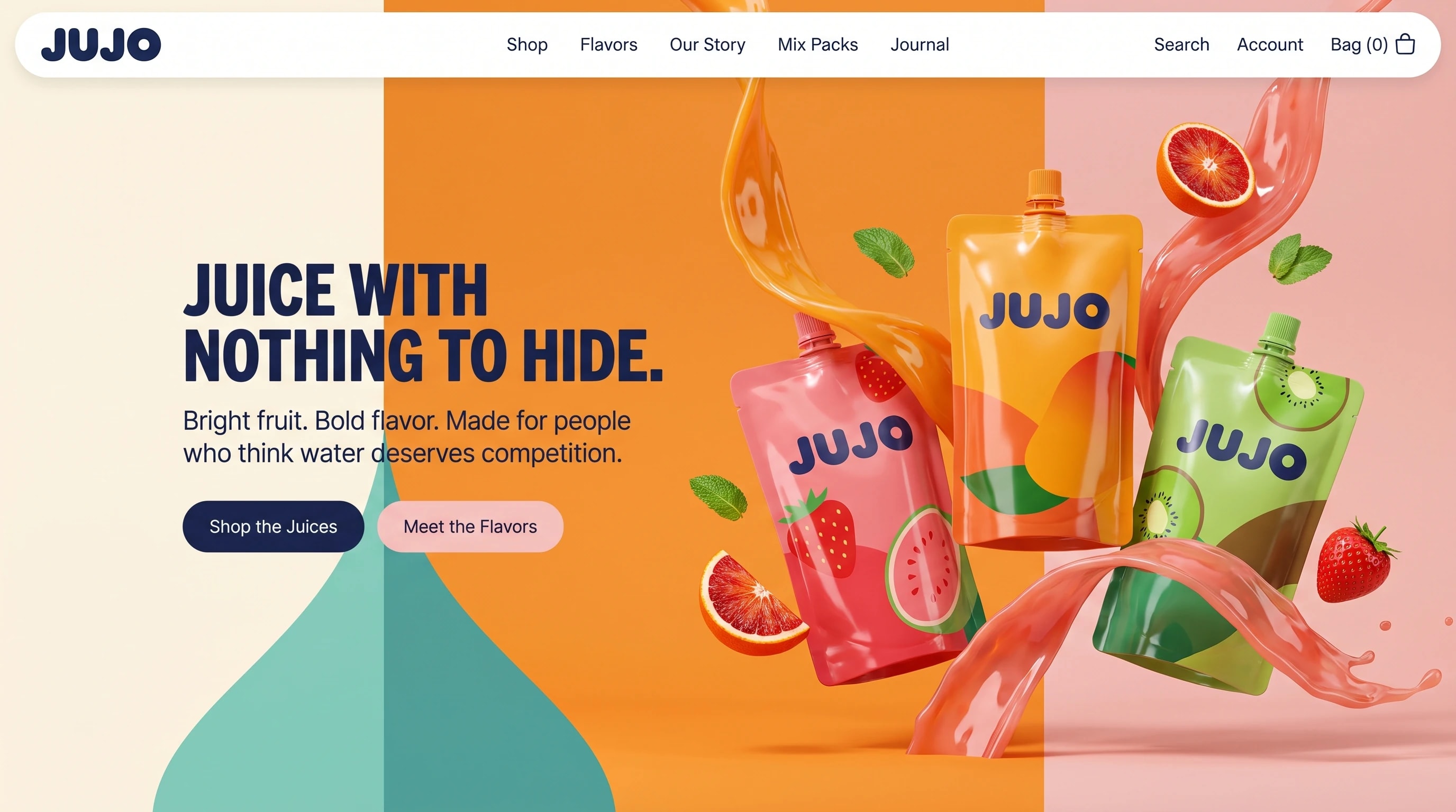
Color blocked into vertical fields, one navy ink across every field, and a floating pill navigation so the chrome never fights the packaging.
Energetic but composed. Color does the shouting, type stays level.
Orange, pink and mint fields under a single navy ink.
A heavy rounded grotesk, matched to the pouch lettering.
- Display
- Heavy rounded grotesk
- Text
- Neutral grotesk
A heavy rounded face for the statement, matched to the weight of the pouch lettering.
Loud color,quiet structure.
Vertical color fields carry the page while the product and splash cross them, held together by one navy ink and a floating navigation pill. On a phone the fields stack and the pouches drop below the statement.
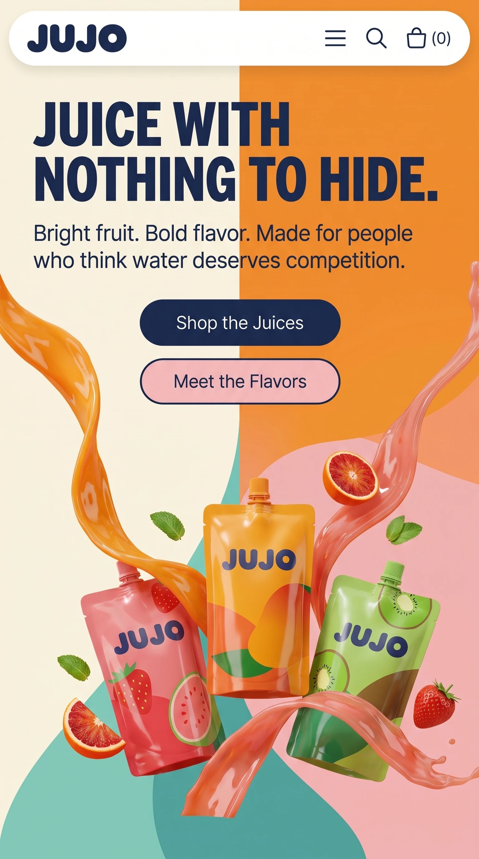
The same page on a phone: the color fields stack and the pouches drop below the statement.
The name, carried off the screen.
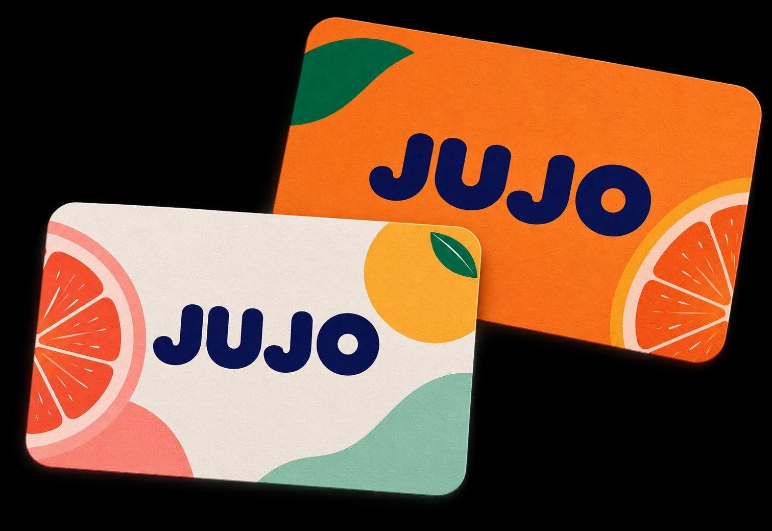
The brand’s typography and color palette, carried through to its business cards.
One business,one voice, everywhere.
A brand that reads as loud and considered at the same time.