AUREN
A premium fashion website built on minimalist art direction and editorial product storytelling.
- E-commerce website
- Responsive design
- Visual direction
What the businesswas up against.
Fashion commerce tends to bury the garment under badges, banners and urgency. The task was a shop that behaves like a lookbook without losing the ability to sell.
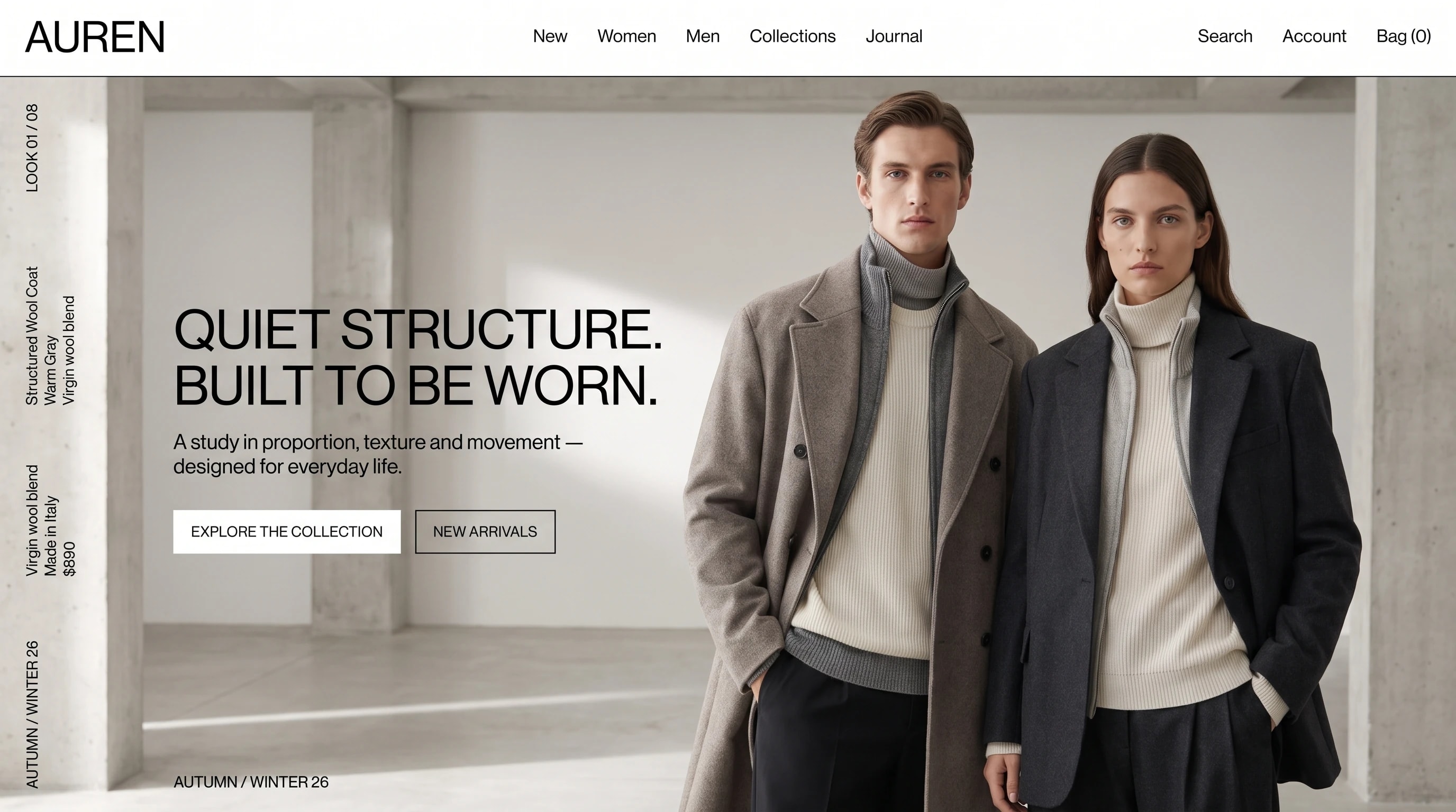
Monochrome and full bleed. Campaign photography holds the frame, the look index runs rotated down the margin, and product facts are set small enough to stay out of the way until they are wanted.
Editorial. No countdowns, no badges, no shouting.
Warm white, black and gray, taken from the garments themselves.
A single neo-grotesk, tight and large for the statement.
- Display
- Neo-grotesk
- Text
- Neo-grotesk
One typeface throughout, set tight and large, so the garment carries the page alone.
A shop thatreads as a lookbook.
The campaign fills the screen with the look index rotated along the left margin, material and price set quietly beside it. On a phone the photograph stays full bleed and the two actions stack under the statement.
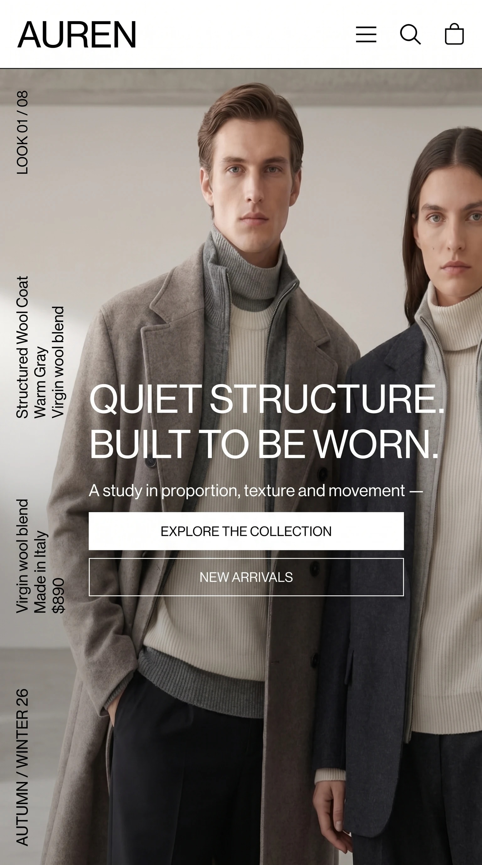
The same page on a phone: the campaign stays full bleed and the two actions stack beneath it.
The name, carried off the screen.
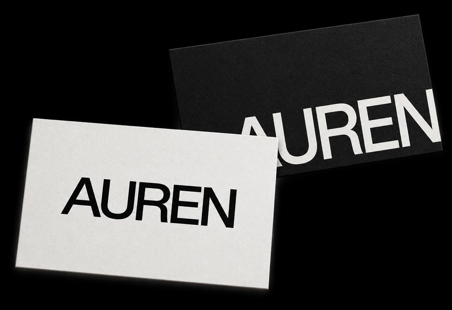
The brand’s typography and color palette, carried through to its business cards.
One business,one voice, everywhere.
A shop that reads as a collection rather than a catalog.