VELORA
A tactile skincare website pairing sculptural product imagery with a restrained shopping experience.
- E-commerce website
- Responsive design
- Brand direction
What the businesswas up against.
Skincare pages usually lead with claims. The task was to let material and texture do the persuading, and keep the ingredient facts legible rather than decorative.
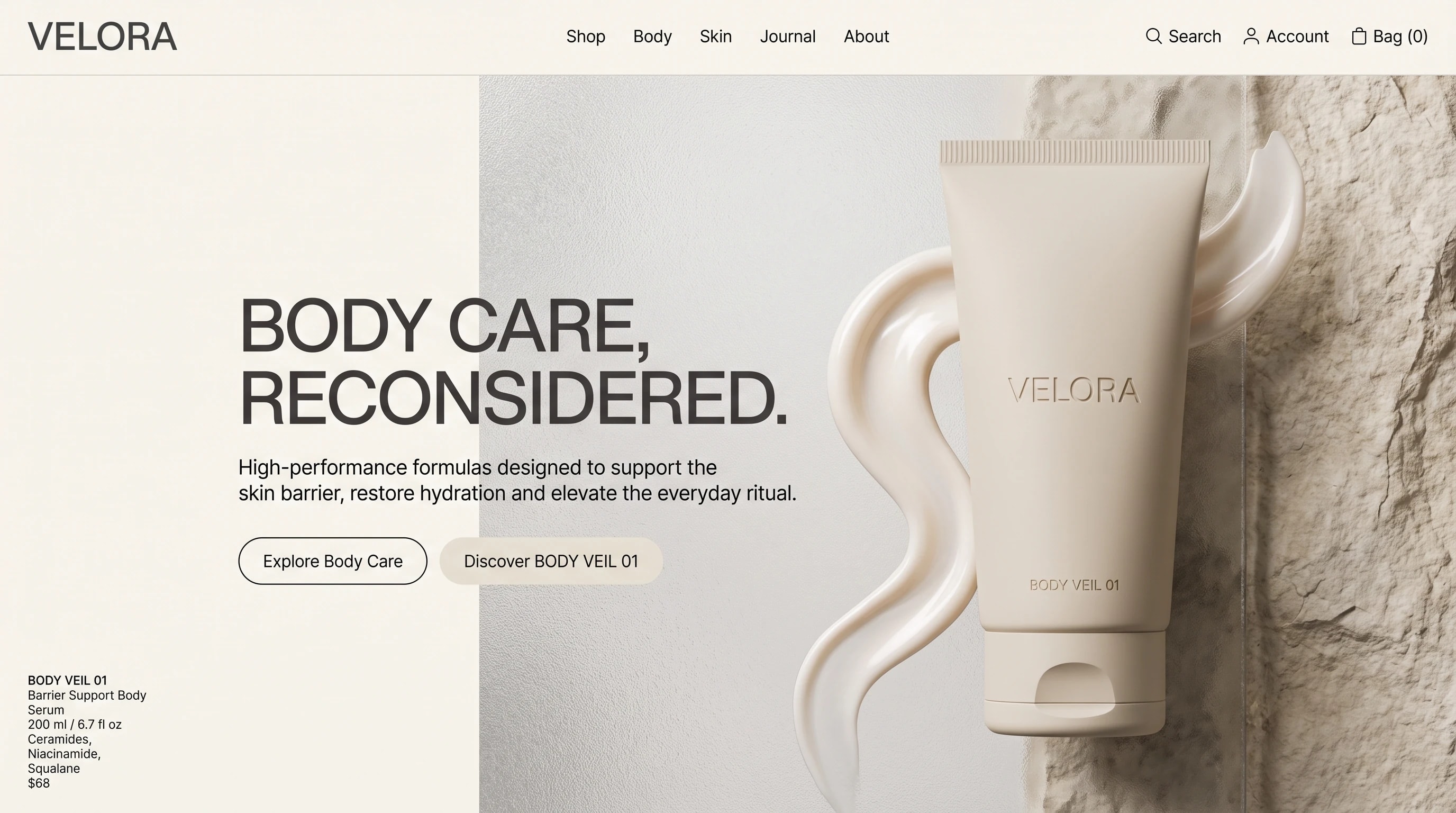
Bone, pearl and stone. The product is photographed against raw texture with the cream itself as the graphic, and the page is split so type never sits on top of the object.
Calm and factual. Ingredients listed, nothing promised.
Bone and stone, borrowed from the packaging.
Wide quiet capitals for the statement, small caps for the specification.
- Display
- Geometric grotesk
- Text
- Neutral grotesk
Wide, quiet capitals for the statement; product facts set small and left aligned.
Texture first,claims never.
The page splits down the middle: statement and actions on the left, product and texture on the right, with the formula details anchored bottom left. On a phone the type sits above the photograph and the actions become full width.
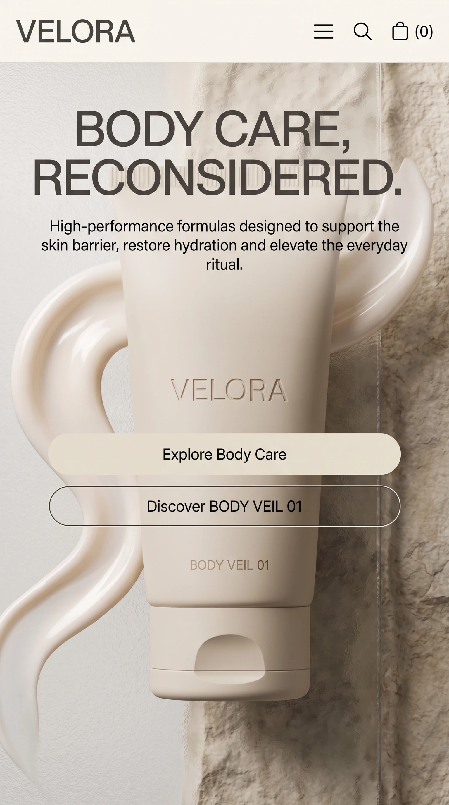
The same page on a phone: type sits above the product, and both actions run the full width.
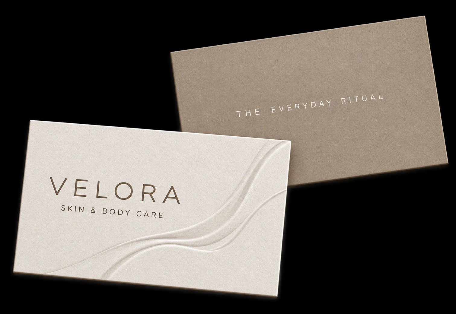
The name, carried off the screen.
The brand’s typography and color palette, carried through to its business cards.
One business,one voice, everywhere.
A shelf that reads as expensive without making a single claim.