Simply Painting
A bold black-and-yellow redesign for a Seattle-area painting company, built around its own real project photography.
- Website design
- Art direction
- Responsive design
What the businesswas up against.
A painting company's website usually looks like every other painting company's website: a stock roller, a blue-and-white template, a contact form nobody trusts. Simply Painting already had the proof — real project photos, a 5.0 rating, over a decade in business — the site just wasn't showing any of it.
Black and safety yellow, the two colors already on every can and every strip of tape on a job site, pushed hard instead of softened into a pastel. A heavy condensed display face carries the promise in three words; a plain grotesk carries the hours, the price and the phone number.
A near-black ground with one working yellow, read straight off a paint can rather than dialed back.
A pinned wall that a scrolling paint roller physically recoats — wet edge and roller texture included — before revealing the line underneath it.
A heavy, condensed uppercase display face for every statement, paired with a plain grotesk for hours, pricing and the phone number.
- Display
- Archivo
- Text
- Inter
A heavy, condensed uppercase Archivo for every statement, paired with Inter for the details that have to stay legible at a glance — hours, pricing, the phone number.
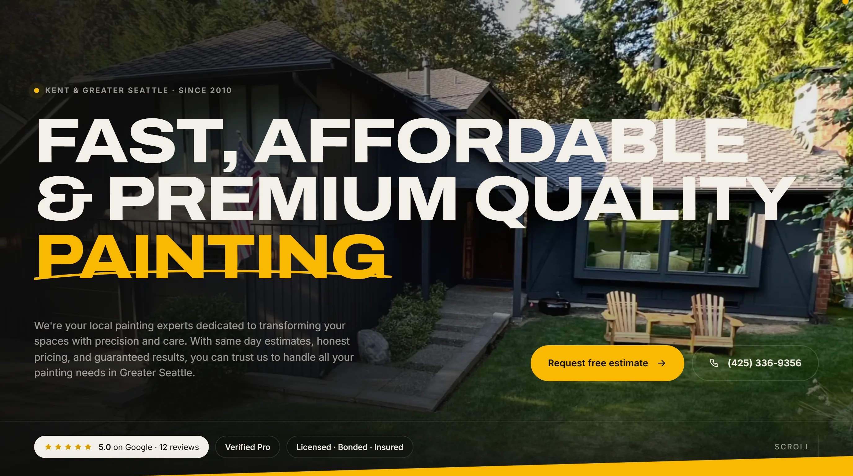
Fast, affordable& premium quality.
The homepage opens on a real jobsite photo with the offer stated in three words, and real trust signals — a 5.0 rating from 12 Google reviews, licensed, bonded and insured — sit within reach of the first scroll. Further down, a pinned wall gets physically repainted by a scrolling roller before the page opens into a horizontal gallery of real completed jobs and a services list where hovering a service swaps in its own photo. Everything, including the paint-drip scroll indicator, still works, and stays fully readable, with motion turned off.
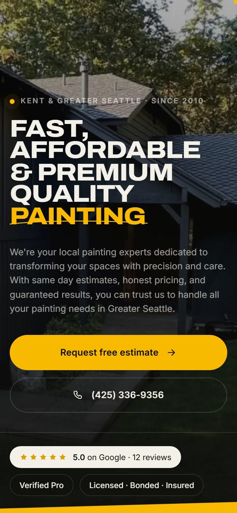
The same hero and roller scene, rebuilt for a thumb: the wall repaints in a shorter scroll, and the gallery and services list both run full width.
The name, carried off the screen.
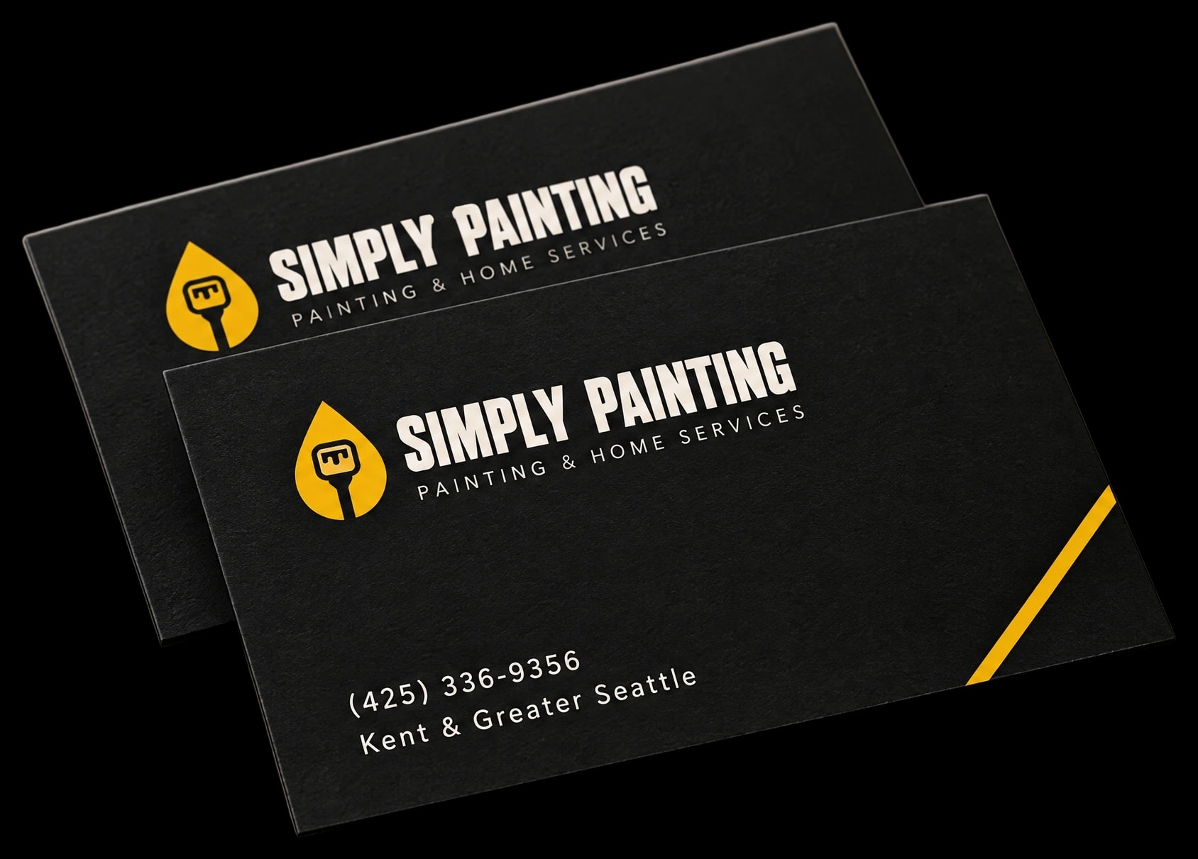
The brand’s typography and color palette, carried through to its business cards.
One business,one voice, everywhere.
A local painting company that now looks like it could operate in any city, while still opening on the same real work, the same real rating and the same phone number that already earned it.