Velmont Estates
A luxury real-estate website built on architectural imagery and an editorial property search.
- Website design
- Responsive design
- Visual direction
What the businesswas up against.
Property sites flatten extraordinary homes into rows of thumbnails. The task was to hold one residence on screen long enough for the architecture to register.
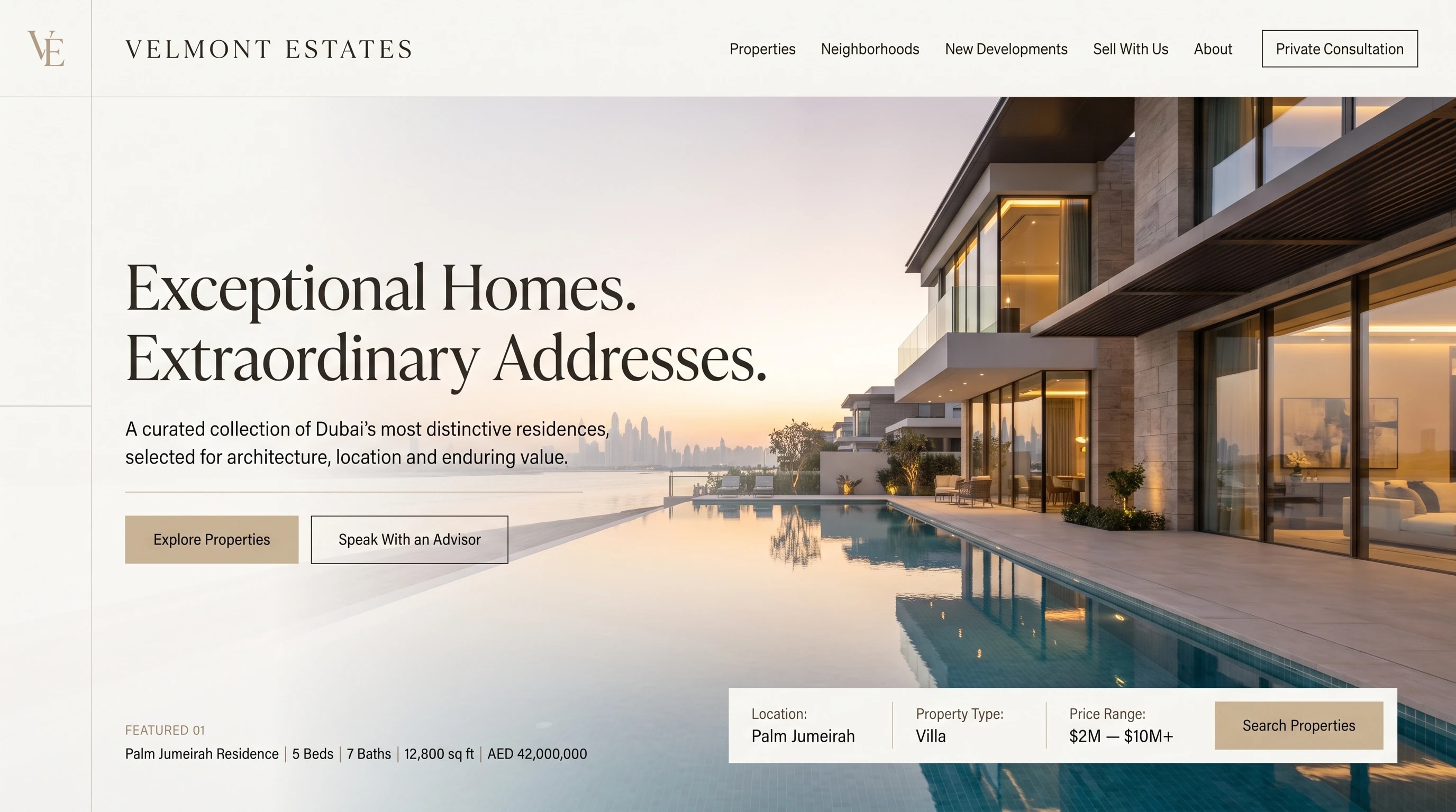
Restraint as a signal of value. Warm stone and charcoal with a single brass accent, a high-contrast serif for the statement, and photography given the full width of the screen.
Understated. The house is the loudest thing on the page.
Stone and charcoal, with brass reserved for one action.
An editorial serif for the statement, a grotesk for the specifications.
- Display
- Editorial serif
- Text
- Neutral grotesk
A high-contrast serif for the statement, a plain grotesk for every listing detail.
One house,one location.
One residence is the focus of the opening frame — the Dubai skyline in the background establishes the location. The search is reduced to three fields and pinned along the lower edge. On a phone the photograph takes the full screen and the search becomes a stacked panel.
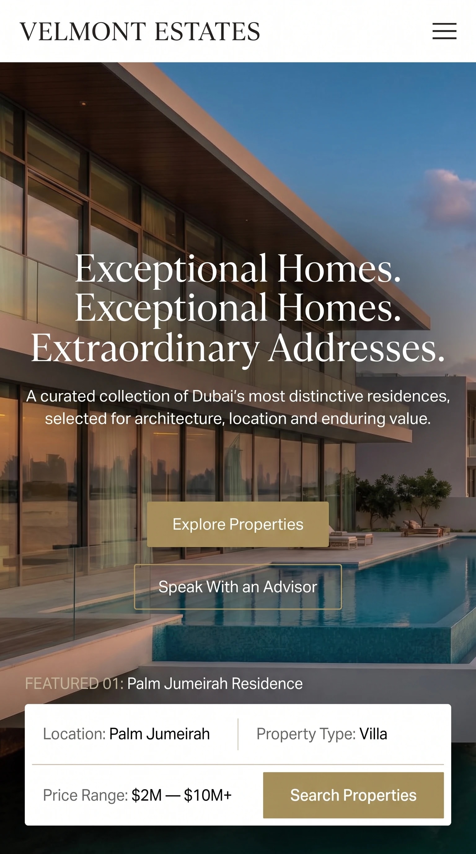
The same page on a phone: the residence full bleed, with the search folded into a stacked panel.
The name, carried off the screen.
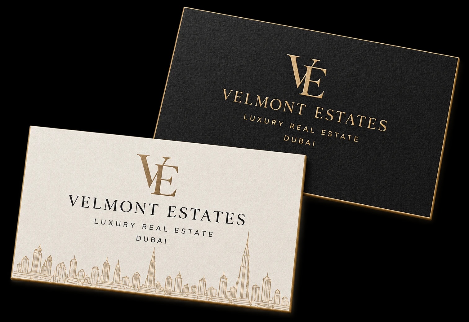
The brand’s typography and color palette, carried through to its business cards.
One business,one voice, everywhere.
A practice that presents at the level of the homes on its books.