Vernier
A dark, exact storefront for a caviar house that measures everything: grain in millimetres, salt in percent and a lot number anyone can look up.
- Website design
- Art direction
- Product storytelling
- Lot lookup page
- Responsive layouts
What the businesswas up against.
Caviar is sold on trust, and trust usually means a gold lid and a vague promise. Vernier wanted the opposite: a house that publishes its numbers, so the site had to make a measurement feel like luxury.
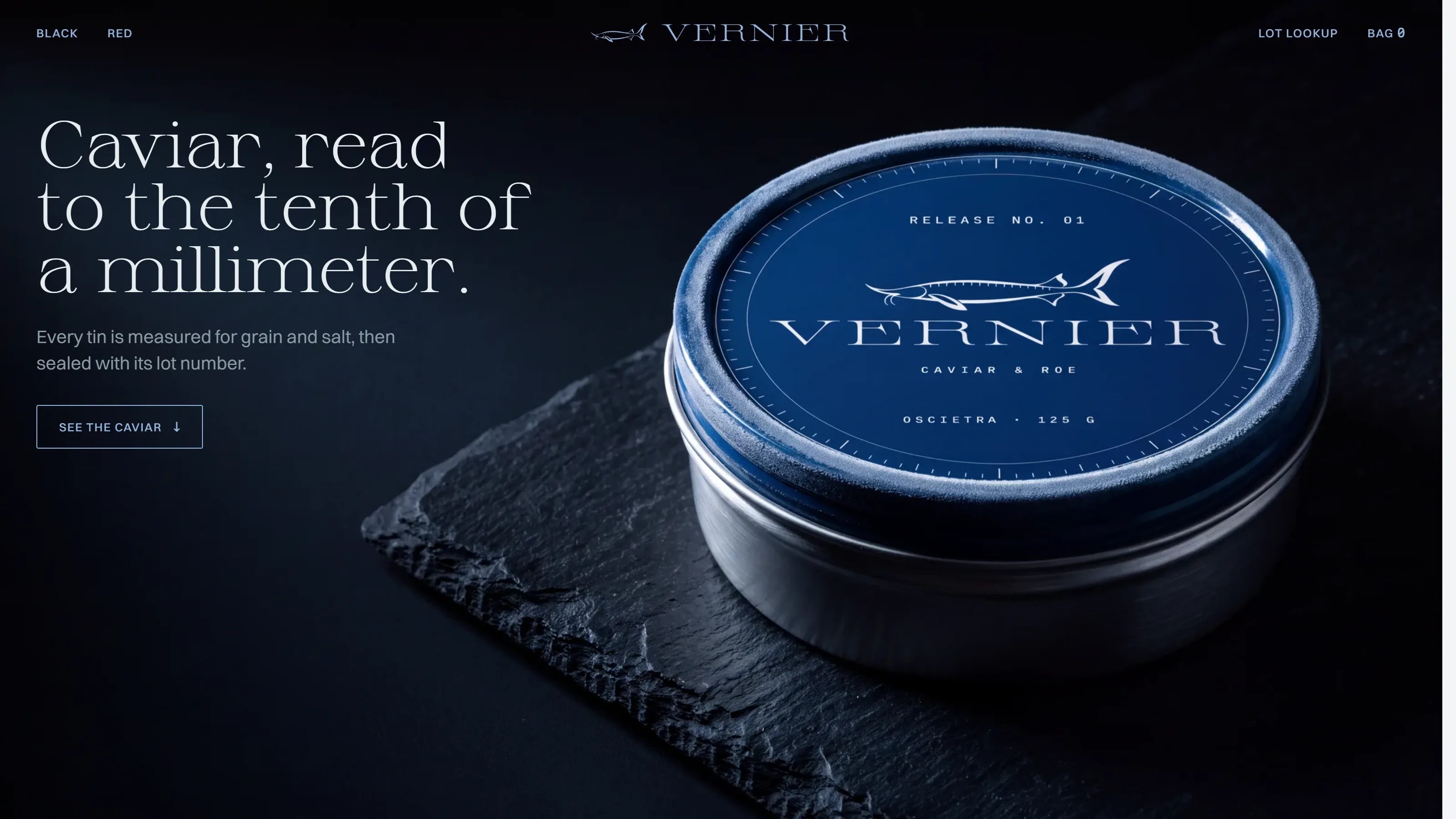
A black room with one object in it — a navy tin on slate — and a single cold blue taken from its lid. A light serif for the claims, a quiet grotesque for reading and a monospace for every measurement, so the numbers look like instrument readings instead of marketing.
Calm, exact and a little dry. The site states grain size, salt and lot number and lets the product do the rest.
Near-black, bone white and one cold tin blue; the only warm thing on the page is the food.
Sprat, a light serif, for statements, Switzer for reading and Martian Mono for every measurement.
- Display
- Sprat
- Text
- Switzer
Sprat, a light serif, sets the headline like an engraved scale, Switzer carries the reading text, and Martian Mono prints every measurement — grain, salt and lot number — like a reading off an instrument.
Caviar, read to the tenthof a millimeter.
The page opens on the tin itself and the promise in a single line, then reads like a lab sheet written by a chef: three sturgeons measured to the tenth, keta salmon roe and trout roe in red, the lid opened band off and lid up, ten minutes on ice, then the spoon, the hand and blini — and a lot lookup that closes the loop on every tin.
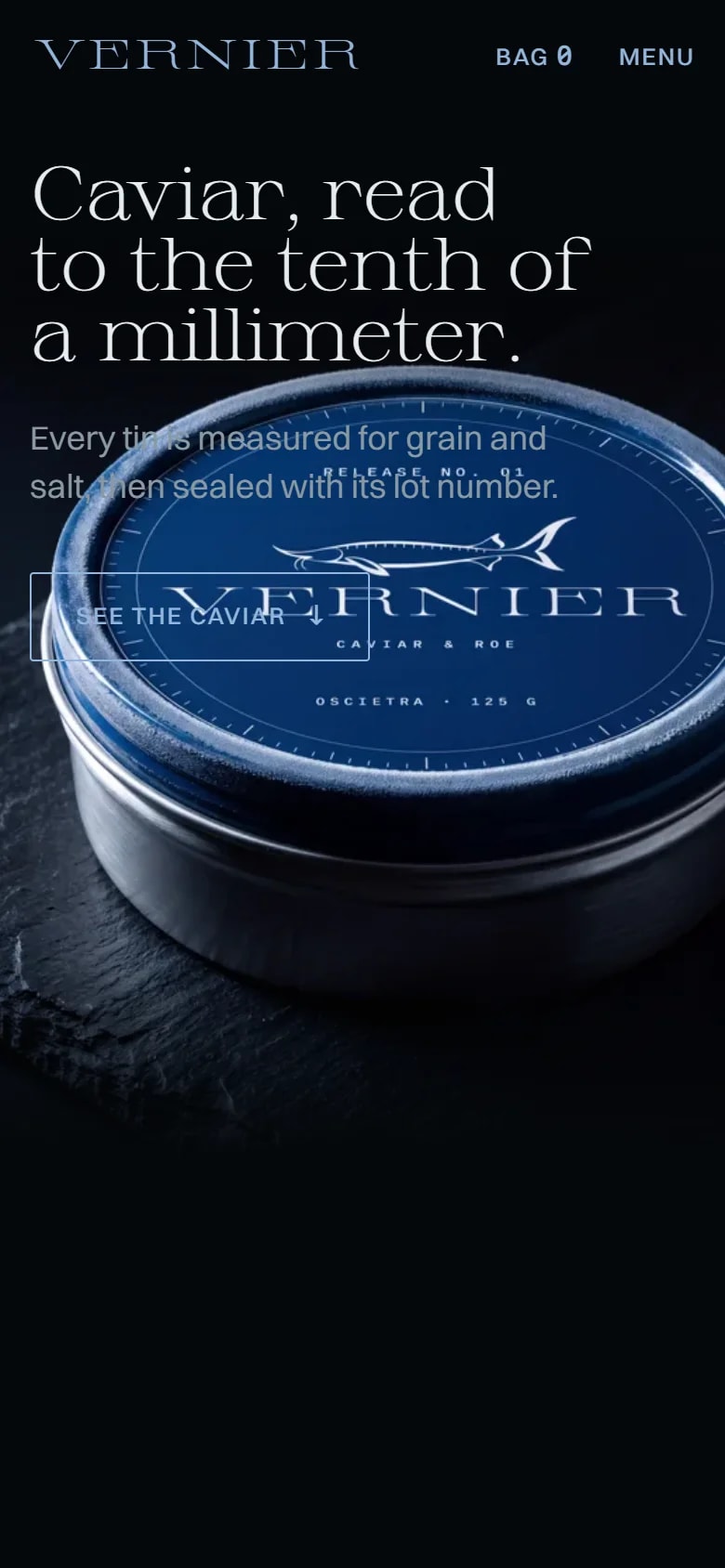
The same tin and headline rebuilt for a thumb: the navigation folds into a menu button beside a bag counter, and the numbers keep their monospace.
One business,one voice, everywhere.
A caviar storefront that sells with measurements instead of adjectives, and gives every tin a lot number a customer can check.